From soothing hues to vibrant flashes of color, plant shops across the country are embracing color blocking to create visually interesting in-store experiences while beautifully merchandising curated products by color.
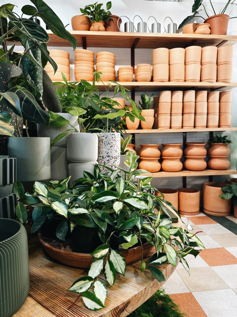
“The thoughtful layering of like colors in a retail environment offers an artful ‘path’ of exploration,” explained Becky Hillis, Creative Director at Accent Decor. “It creates mini destinations that speak to numerous customer types and tastes. Plant shops are especially able to articulate their point-of-view and personality through color. It’s fun to experience and shop this way when a merchandising team has clearly poured their hearts into creating an intentionally curated shop.”
The best color blocking experiences feel fresh, airy and discover-worthy, allowing customers to enter a welcoming space to explore and seek the hues they love most. Whether the palette is filled with calming neutrals or flashes of bold color, the experience is often peppered with various pots and planters, plant accessories and home accents. “We hear from many plant shop and home and gift customers that neutral tones of white, off white, grey and shades of terracotta are popular for executing color blocking,” shared Caroline Woods, Design Manager at Accent Decor. “Shades of ochre, citron, cobalt blue, softer greens and lilac are increasingly popular.”
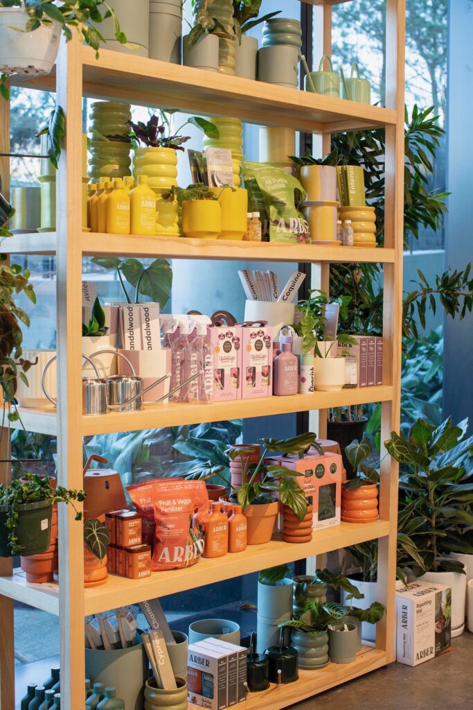

In a new series, we interviewed two customers on different coasts to lend their expertise and insights on the art of color blocking. First up, we sat down with Libby Hockenberry, Co-Founder & Curator of The Victorian Atlanta, a creative plant shop with the belief that plants and people belong together. The Victorian Atlanta was created to offer not-so-common plants along with the indoor staples that everyone knows and loves, plus handmade pottery from both local Atlanta artists and global artisans. With two locations in East Atlanta Village and Old Fourth Ward, both offer locals a curated shopping experience resonating with plant newbies and plant pros alike.
How does color-blocking improve or impact the customer shopping experience?
We find that using color in our visual merchandising easily allows the customer to navigate towards their preferred color palette. From there they can shop the perfect planter or accessory to complement their personal style and setting. It also provides rest in the space. Our shops are on the maximalist side when it comes to inventory. Blocking out color helps tone down volume while creating an environment that feels less busy and cluttered with pots and planters. Our signature terracotta wall is a feature in both of our shops, and it makes a beautiful backdrop for the various tones of green plants we offer.

How does color-blocking create efficiencies for the team at The Victorian?
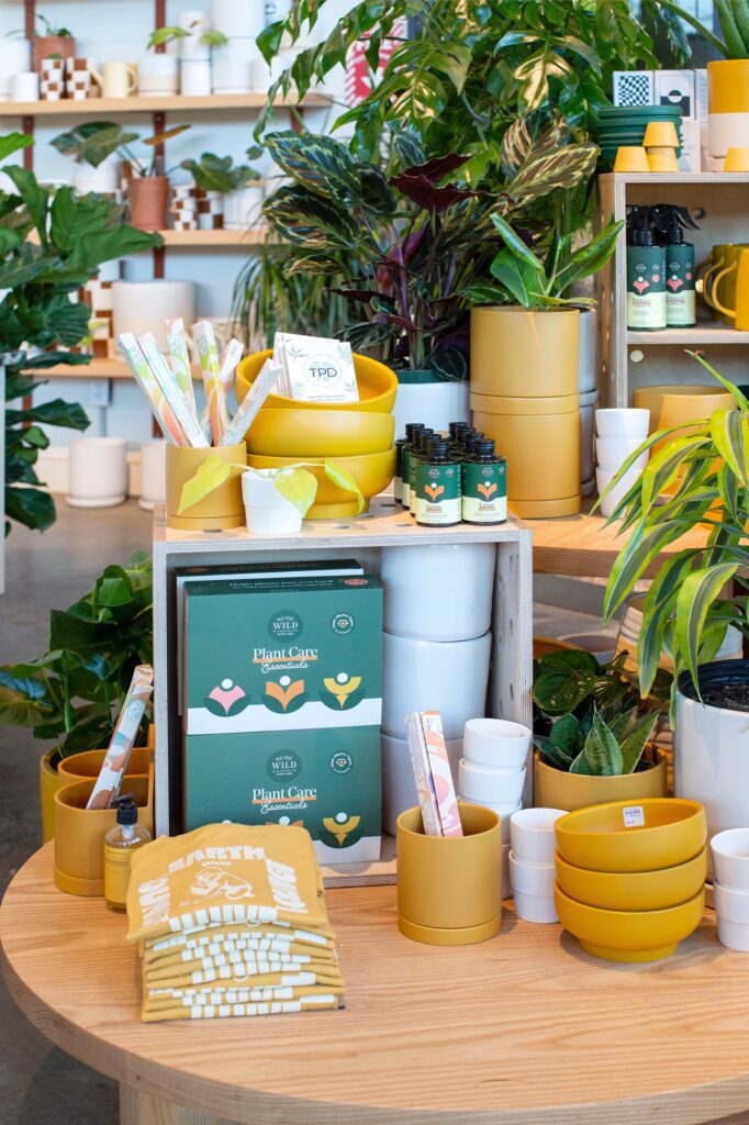
We offer a streamlined color selection in terms of pots and planters. We aren’t the shop to offer every single color in the rainbow, rather, we choose to curate a selection of colors that work well in our shops. These colors also work well together. Sometimes when there are too many color choices the customer can get overwhelmed. Good curation is one of the pillars of our business and is something that keeps our customers coming back.
Do you stick to a certain set of hues, or do you change it up by season? Share your approach.
We have a core set of hues that we always carry. Depending on the season we may introduce different colors or tones. Over time, we’ve found which colors work and don’t work for us. We tried cobalt one year and learned quickly that we aren’t a blue shop.

How does color impact your buying and sourcing journey? Do you seek certain colors & textures? Or do you let trends & customer insights lead the way?
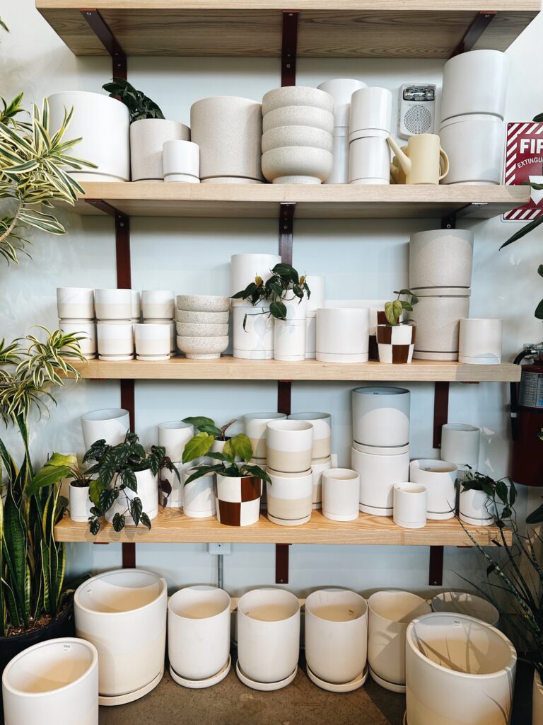
We don’t always lean into every trend if it doesn’t fit into the vibe of our store. However, we listen to what customers are searching for. Color is one of the most important factors when sourcing pottery. Some colors can make products look cheap – color is always top-of-mind when sourcing.
Your stores are beautifully executed. Share your approach on creating an artful and inviting retail experience.
First of all, thank you! My approach is centered around sourcing products I want in my home or to design a space with. I’ve always said that I buy my favorite things and put them in the shop to sell. I have good instincts on what works and what doesn’t work. Overtime I have learned who our customers are and what types of items they want to purchase (and not purchase). Visual merchandising sets our plant shop apart from others – it’s a significant and important focus for us. Customers want to enter a space where collections are grouped together and things are easily laid out and displayed allowing them to visualize the items in their home. Visual merchandising is critical and I think so many shops don’t place enough emphasis on it. Ultimately, I think it comes down to figuring out who you are as a shop and what kinds of items and colors you want to carry in your store.
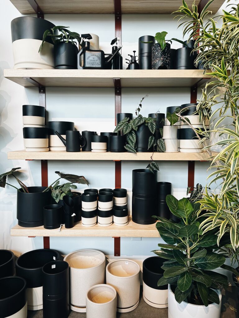

Keep up with The Victorian Atlanta on their website or @thevictorianatlanta for the latest calendar of workshops, community events and store happenings. Mark your calendars for a grand re-opening party at the East Atlanta Village location on Saturday, April 27, 2024.


To shop Accent Decor’s wholesale decor and wholesale pots and vases including all new and flower, plant and home products, visit accentdecor.com.
READY TO BECOME A CUSTOMER?
A quick and easy registration gives you access to design-forward wholesale decor, wholesale pricing, product details ordering options, and much more! Register now.



COMMENTS ARE OFF THIS POST